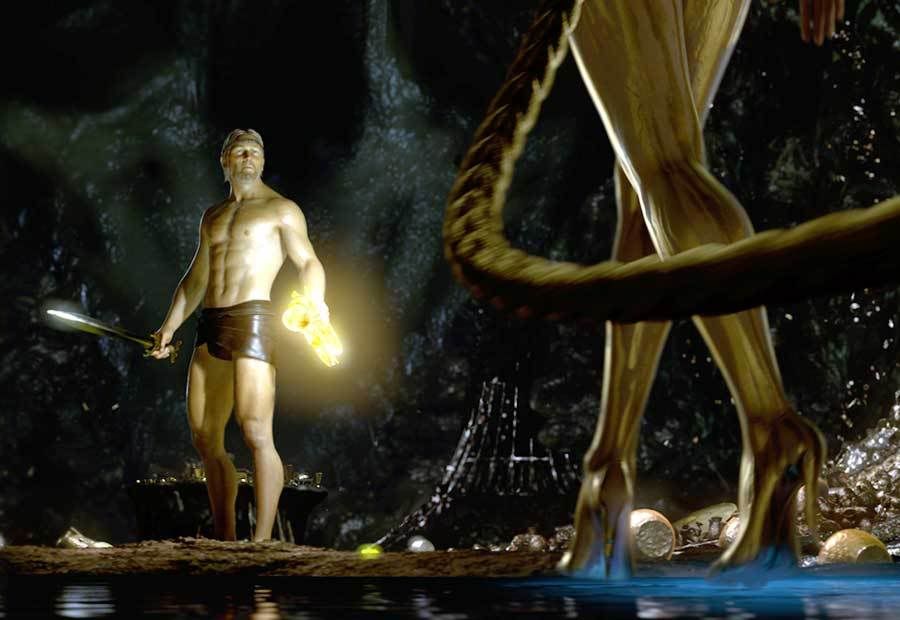
Every layer of Beowulf exhibits extremely poor use of digital enhancement as well as makes some atrocious faux pas in the realm of filmmaking in general. I believe this scene is an appropriate showcase of everything that is wrong with this film. I understand that motion-capture technology was used in the making of Beowulf and I am sure the filmmakers initially had good reason for this: maybe to save money on actors’ time, attempt to create visual representations on screen out of what was taken from the text, or to make the film seem larger than life. Also, someone in class noted that Beowulf might have been riding the wave of the film 300 and its box office success. But whatever the reasoning was behind it, the digital enhancement fell flat. The actors appear to be made out of clay and the costumes look like they are from Shrek. In the scene above, Ray Winstone’s character is mannequin-esque even, his eyes have no depth and his body appears completely sculpted (in the literal sense.) And of course, let’s not forget what Ray Winstone actually looks like…
 a far cry from this strapping young depiction of Beowulf. Also, it would be just plain wrong not to mention Winstone’s “bulge” rivaling that of David Bowie in Labyrinth, and certainly surpassing his own in Sexy Beast. Angelina Jolie’s character doesn’t look genuine in any way either. Her heels (or hooves?) in the foreground of the shot are seamless with her legs. The metallic skin color makes her appear to be a robot or futuristic space lady rather than an ancient heathen monster. Also, for some reason, her hand is natural skin tone, not gold. But the worst part of this scene is the lighting. I understand that the mead cup/horn/dragon is supposed to be a beacon of sorts in the story and needs to glow or illuminate. But the lighting on the horn along with the unnatural balance of it shining on his sword is simply hideous. Nor do the shadows in the scene match that of where the light would naturally have them hit. As if this film wasn’t enough of an eyesore in the first place, they had to offend their audience with fake lighting. This is the type of scene that makes a viewer feel ripped off (even if they did stream it for free!)
Blog is okay but is a bit general. I really wanted you to look at a specific scene and evaluate the weakness of the mise en scene; then you should have said how you would change those elements to improve the scene.
ReplyDelete