Another point that I thought was disappointing is that the character looks nothing like Ray Winstone. When I saw the trailer, I really believed that it was Sean Bean instead. Take a look at the pictures below. Sean Bean is on the right, the scene is from the movie troy. Ray Winstone is on the left. Now compare it to the middle picture of the animated Beowulf.


The scene that I thought needed the most change was the one at the end when Beowulf fights the dragon and cuts off his arm in order to reach its heart. First of all, the dragon does not look very scary, I would rather say his face looks goofy. However, the thing that shocked me the most was when Beowulf cut off his arm, it looked so unrealistic, he barely had the sword in his shoulder and just like that the limb came off. I was also surprised that he was able to reach the heart with his hands after losing his sword. This does not makes sense, the sword gave him more range and he still was not able to impale the heart even when he swung himself to get a boost. How could he do it with 2 feet less. I think they should redo that scene and instead of cutting his arm off, he would make a bigger hole into the dragon's flesh in order to actually go in and take the heart off. Of course, the sacrifice feeling would be lost since the self inflicting pain factor is gone but it would look better overall.

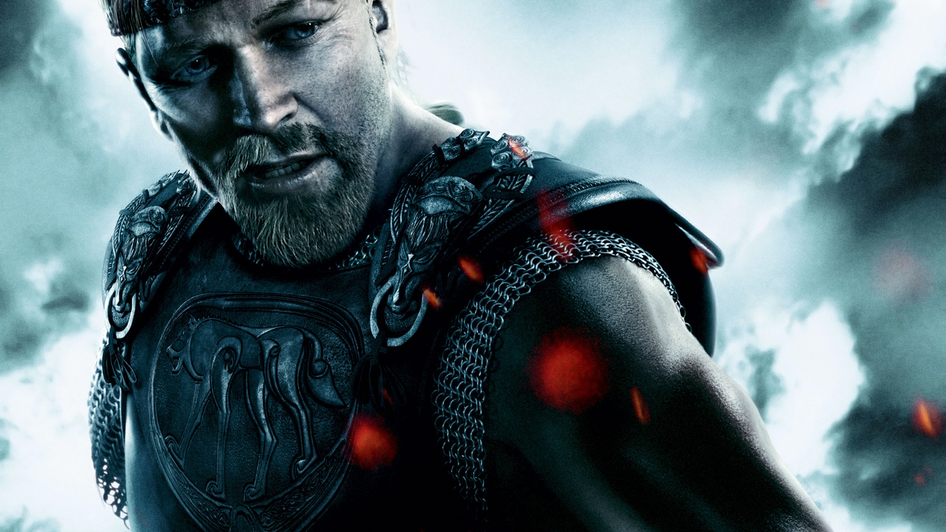
Mise en scene analysis:
Dominant: our eye is attracted to the dragon's face first because it is in the center of the screen and it is the biggest thing that we can see.
Camera Proxemics: This would be a public shot if we focus on the main character. He is pretty far away from the camera and his whole body is revealed as well as the environment around him.
Angle: We are looking up a both the dragon and Beowulf which suggests that they are both importants in the plot of the movie.
Color values: The dominant colors are red and blue. The dragon being red and the sky blue. There is a contrast here between these two colors. Just like fire and ice. It tells us that this is a fight against good and evil which makes sense since the Dragon is red and would represent aggressiveness, the color of the blood.
Depth: The image is composed on two planes. There is the midground where the dragon and Beowulf are located and the background which is the sky.
Character placement: on the frame space, the characters occupy the center because the director wants us to see them as important and where the action takes place. Keeping them in the middle also helps us focus on what is going on by keeping track of where they are.
Staging positions: It seems like both Beowulf and the dragon are looking down at the camera suggesting that something is taking their attention.
I cannot believe no one mentioned the other Beowulf, there were 3 in total but this one looks very cheesy until the last fighting scene which I think is why the new one was made animated so the computer made monster against real characters would not look so bad.
This is a short spoof of the movie that I thought you would enjoy:
Quentin, Do not forget to label the blog and use you full name in the label. Use only your last name in the title. Excellent mise en scene and excellent points about your liking the movie.
ReplyDelete